
Key Points
p95 response time is a load performance metric that shows the response time threshold 95% of server requests completed faster than, giving a clearer picture of real user experience under load than an average response time figure alone.
– The problem: Averages hide the slow end. A host can look fast on paper while 1 in 20 page requests takes noticeably longer, and that pattern is invisible behind the average.
– What p95 measures: Rank every response time from fastest to slowest. p95 is the mark 95% of them beat. One request in twenty was slower.
– The session effect: A learner clicking through a course module makes 10 to 15 requests per sitting. At 1-in-20 odds per click, the probability of hitting at least one slow request in a 10-click session is around 40 percent. Across most sessions, it is close to guaranteed.
– Why LMS sites are most exposed: Logged-in users skip page caching. Every request hits the server fresh, so there is no cached shortcut pulling the average toward fine.
– What the 2026 benchmarks show: The independent WP Hosting Benchmarks test p95 under real concurrent load. TXP placed at or near the top in all three price tiers it entered, with p95 scores of 148.7ms, 114.4ms, and 106.6ms.
The independent 2026 WP Hosting Benchmarks test something most hosting providers do not advertise: how their servers hold up when dozens, hundreds, and even thousands of real users are online at the same time. One of the metrics they benchmarked in the report is p95 response time. TXP placed at or near the top of that measure across all three price tiers it entered.
Most people who come across that result have not encountered the metric before. Here is what it actually measures, and why we built for it.
What average response time actually measures
When a hosting provider says their server averages 180ms response time, they are telling you the average (mean) across all requests. The average is a reasonable number, as long as the spread of results is fairly even.
Response times are not even. They behave the way your daily commute to work does: mostly the same, with the odd morning that throws the whole plan off.
If your drive to work takes 20 minutes on a normal day but 90 minutes on the rare morning an accident blocks the road, your average commute still works out to about 23 minutes. Technically accurate. Not especially useful when you are deciding how early to leave to make an 8am meeting.
Server response times work the same way. Most requests come back quickly. A small number come back significantly slower. The average stays flat either way, while those slower responses keep hitting real users.
Take a concrete example: a server that handles 19 requests in 120ms but takes 900ms on the twentieth has an average response time of around 160ms. That looks fine on a performance dashboard. The 900ms request still happened. It happened to someone.
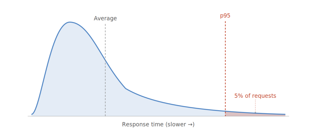
What p95 measures instead
p95 gives you a different view of the same data.
Go back to the commute. You already know roughly three versions of it: the normal morning at around 20 minutes, the freak morning when an accident stretches it to 90, and the bad-but-regular morning in between that turns up often enough that you half expect it. That middle one is your p95. Not the average day, and not the once-in-a-blue-moon disaster, but the slow you hit often enough that planning as if it never happened would be reckless.
Put rough numbers on it. Most mornings run about 20 minutes, with a handful at 35 or 40 before you reach the truly bad days. Your p95 lands around 38. Your average sits at 23. Both come from the same mornings, and they tell you very different things. If you cannot afford to be late, 38 is the number you plan around, not 23.
For server response times, p95 is the response time 95 percent of requests beat. When average and p95 are close, the distribution is tight and the average is broadly trustworthy. When they diverge, slow requests are getting significantly worse than the average suggests. The gap between them is what the average is hiding.
Performance and infrastructure teams moved to tracking p95 for exactly this reason. As Gil Tene, a performance engineer at Azul Systems, put it in a 2015 conference talk: you can have a perfectly fine average sitting on top of a slow tail, and the average will never show it is there. The Redis engineering blog makes the same point.
Why this matters more for course and membership sites
Most hosting speed tests, including the GTmetrix scores common in hosting comparisons, measure the logged-out homepage. The page that is cached and ready to serve before anyone arrives. It is fast because it is pre-built and stored close to the visitor.
Your members never see it.
When a student logs in to check their progress or pick up where they left off on a lesson, the server builds a page specifically for that person, at that moment. Current progress, assigned group, completed items: none of that can be pre-built and stored in advance. Every click is a fresh request to the server. Caching cannot help here.
Every request your members make is in the distribution p95 measures. There is no cached shortcut pulling the slow ones up. The average and p95 are both measuring the real thing, and the slow end matters more because nothing is cancelling it out.
The commute is one trip. A study session is twenty of them back to back, and that is what changes the odds. TXP’s founder worked through this in his benchmark analysis: a learner completing a module makes well over twenty clicks in a sitting. Every click is another chance to land on a slow response, so the more a member clicks, the higher the odds that at least one comes back slow. At 1-in-20 odds, a 10-click session already carries a roughly 40 percent chance of hitting one. By 15 clicks it is 54 percent. A real study session runs longer still, module after module, and the number climbs with every click.
That is exactly why p95 matters. The slow response it measures is not a rare event your members might never meet. Over a full session they almost certainly will, and how slow it gets when they do is what decides whether they notice at all.
What the difference feels like
Nielsen Norman Group has researched response time perception since 1968 and their thresholds have not changed much. Below 100ms, a click feels like a direct action. The result feels like something the user did, not something the computer did. Between 100ms and 1 second, the user notices a delay but stays in flow. Above 1 second, the computer starts to feel slow.
TXP’s p95 at the $101–200/month tier is 106ms, just above the threshold where clicks feel instant. The next host in that tier is at 195ms, clearly in the noticeable range. The one after is at 232ms, getting closer to where it registers as a genuine wait.
None of these are above 1 second, so none of them feel broken. But there is a real difference in how each one feels. On a course site where members click through lessons, quizzes, and progress updates every session, it adds up.
One caveat on scope: these are server response times, not total page load times. Total load also includes browser rendering and asset loading. Server response is the component the hosting provider choice matters.
How TXP measures on p95
The WP Hosting Benchmarks run a test called LoadStorm that simulates real logged-in users navigating a WordPress site under increasing load. At the highest tier, that is 2,000 concurrent virtual users, all logging in and browsing pages at a realistic pace. It is the closest thing to an LMS workload that any public WordPress benchmark runs.
A note on the 2026 numbers: the benchmark changed how it calculates p95 this year, using a slightly different measurement method. The figures are best read as directional comparisons within a price tier rather than precise absolute values. Kevin Ohashi, who runs the benchmarks, has documented the change. Within a tier, the gaps between providers are large enough to be meaningful.
TXP’s results across the three tiers it entered:
| Tier | TXP p95 | Rank | Next host |
|---|---|---|---|
| $25–50/month | 148.7ms | 2nd | WPX at 130ms |
| $51–100/month | 114.4ms | 1st | WPX at 149.4ms |
| $101–200/month | 106.6ms | 1st | Pressable at 195.9ms |
The average page response time, which is the primary metric the 2026 benchmarks use for rankings, shows the same pattern: TXP leads in both higher tiers on that measure as well.
These results came from a paid, independent test. We entered it because we wanted external data, not because the outcome was guaranteed.
What to look for in any host
Most providers do not publish p95 voluntarily. The places to find it are independent load tests that put concurrent logged-in users on the server and report what happens to response times under pressure. WP Hosting Benchmarks is the most thorough public example for WordPress.
Average TTFB from single-location tests is worth looking at, but it does not tell you how the server behaves under load. GTmetrix scores measure the cached, logged-out experience, not what your members see. Peak requests-per-second tells you how much traffic the test happened to send, not the quality of individual responses under it.
For an LMS or membership site, the most useful signals are uncached load test results: specifically p95 and average response times under realistic concurrent user counts.
What hosting providers advertise and what determines your members’ experience are not always the same metric. Average response time is not wrong. It just does not show you the slow end. p95 does. That is the number we built for, because it is the one your members actually feel.
If you are working through hosting options for an LMS or membership site and want to talk through what the numbers mean for your setup, get in touch.